Making automation data actually useful for over 100k users.
The problem
ActiveCampaign's automation reporting hadn't been meaningfully updated in over a decade. What existed was an iframe of Looker, bolted into the product and largely forgotten. It was slow, visually disconnected from the rest of the platform, and almost impossible to navigate. Users couldn't find what they were looking for. The data was technically there, but making sense of it required more patience than most people had.
The deeper problem was that the report wasn't answering the questions users actually came in with. Which automations are performing well? Which ones need attention? Why is a specific automation underperforming? Those are straightforward questions. The old report made them genuinely hard to answer.
This was part of a larger reporting overhaul happening across the product, but the automation report was mine to own end to end.
Where we started
The existing report hadn't been touched in over a decade. Here's what users were working with:


Discovery & Research
We started with user interviews, both internal and external, to understand where the biggest gaps were. A few things came through clearly across almost every conversation.
Users didn't have visibility into how their automations were performing at a glance. They had to dig, cross-reference, and sometimes give up. The data existed somewhere in the report, but discoverability was poor enough that people stopped looking. Several users mentioned checking performance in third-party tools or just making gut-feel decisions because pulling the right numbers out of the existing report took too long.
The other consistent theme was around optimization. Users didn't just want to see numbers, they wanted to know what to do with them. A low click rate is only useful if you can connect it to something actionable. The old report gave you data without context, which meant it wasn't really giving you much at all.
We also did competitive analysis to understand how other platforms were approaching automation reporting, and ran usability testing throughout the design process to pressure-test assumptions before we committed to them.
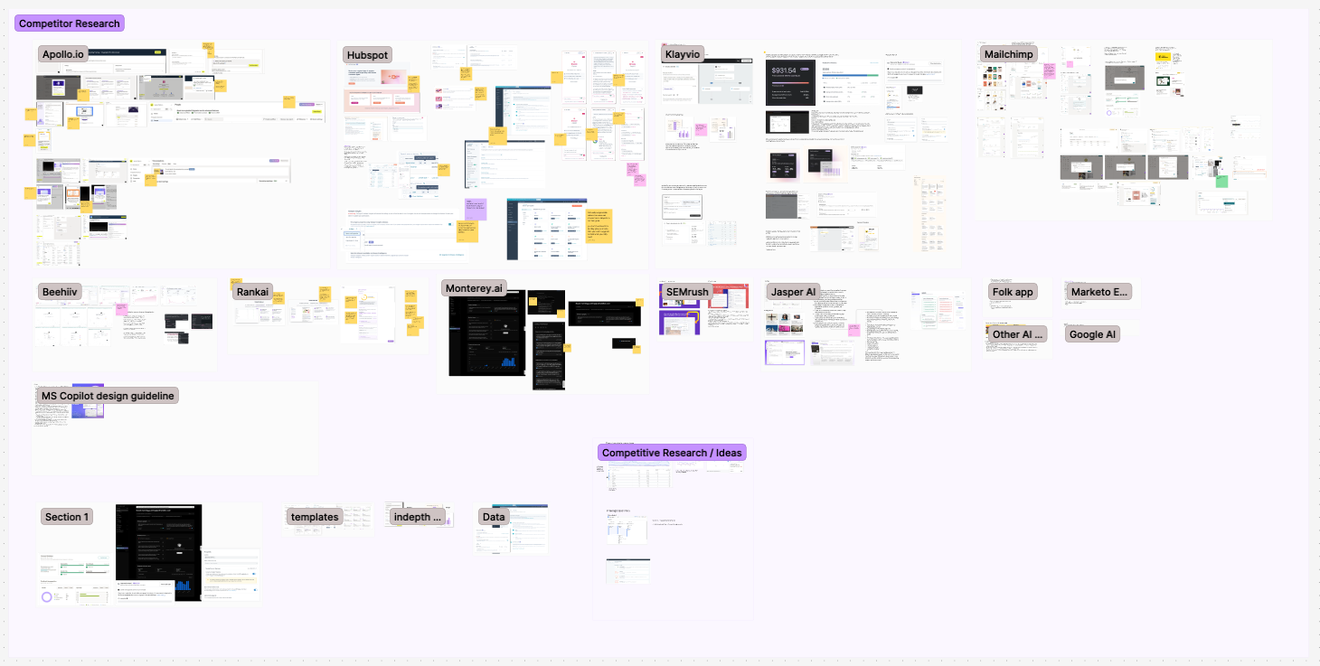
Competitive research to see where we stand in market
Process
The structural challenge was figuring out what to surface and what to let people find on their own. An automation report can show a lot: campaign performance, engagement by channel, entrance sources, contact flow, conversion tracking. The temptation is to show everything. The reality is that showing everything without hierarchy just recreates the problem you started with.
We ran multiple rounds of iteration with a consistent feedback loop between design, stakeholders, and real users. A few questions kept anchoring the work: What does someone need to know in the first 30 seconds? What do they need to dig into? And what can we stop showing entirely?
The hardest call was on the component system. Because this was part of a larger reporting overhaul, anything I built for the automation report needed to work across other reports too. That meant designing for flexibility from the start: a reusable metadata and KPI block that could surface different metrics depending on the report context, without looking like it was purpose-built for just one of them. That constraint made every decision take longer, but it also meant the work had a longer shelf life.
Engineering constraints shaped a few things too. Some data that users asked for wasn't available at the level of granularity they wanted. Part of the process was being honest with users about what we could and couldn't show, and designing around those limits in a way that didn't make the gaps feel like failures.
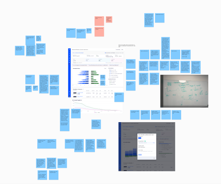
Research synthesis from user interviews
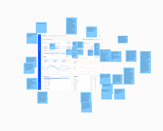
Iteration feedback from usability testing
The Solution
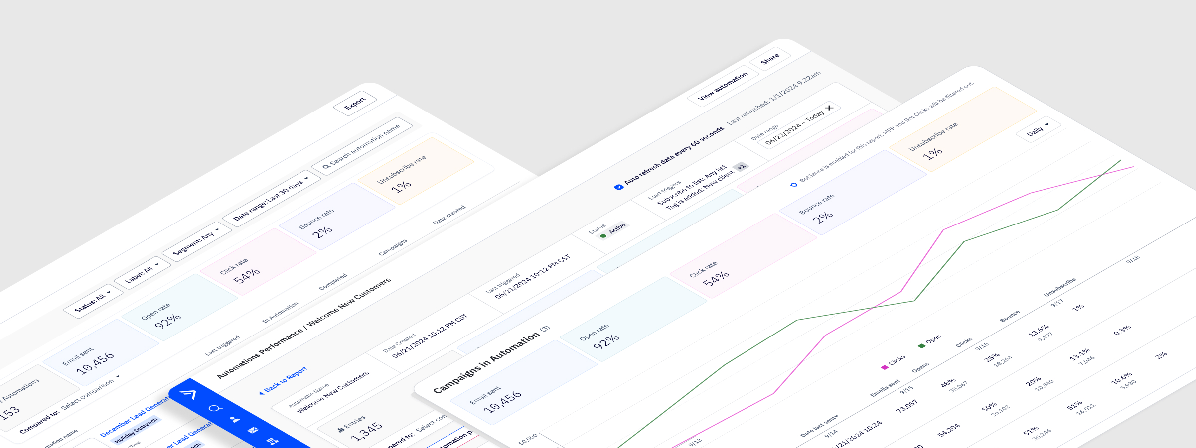
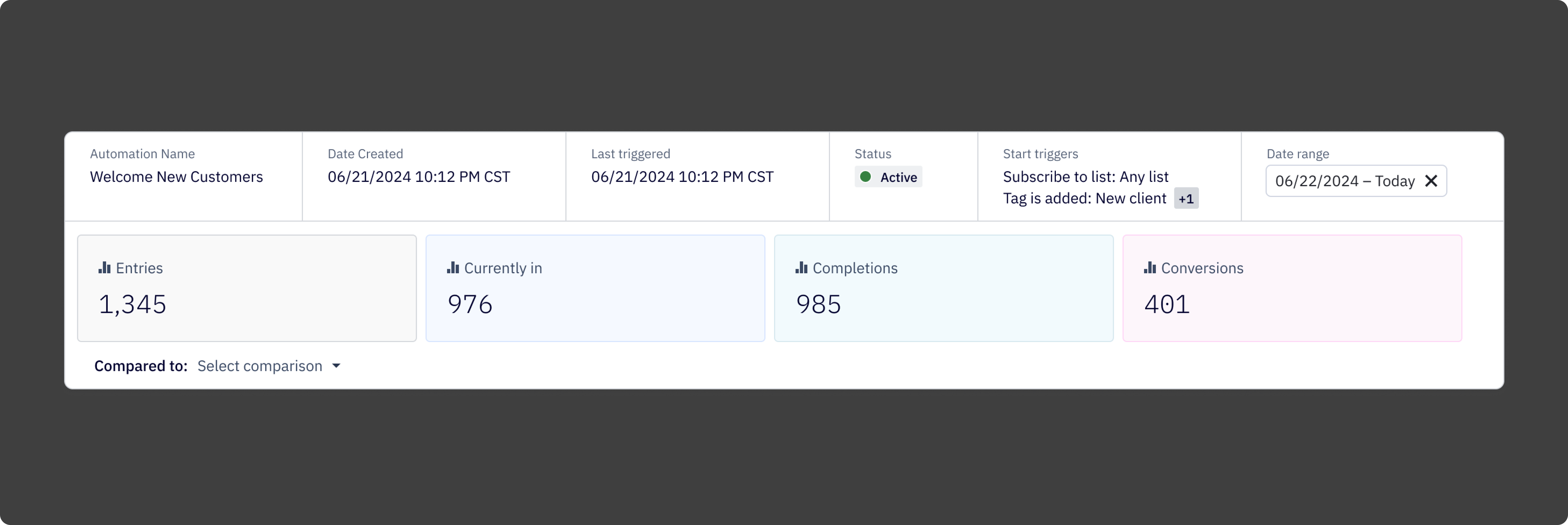
The redesigned report is built around a clear hierarchy: here's how your automation is performing overall, here's how individual campaigns within it are doing, and here's how contacts are moving through it. Each layer connects to the next, so users can start at the summary and drill down without losing their place.
At the top of the report is a metadata and KPI block that gives users the information they most often came in looking for: contacts currently in the automation, completions, conversions, status, triggers, and time-based performance trends. Scannable in seconds, not minutes.
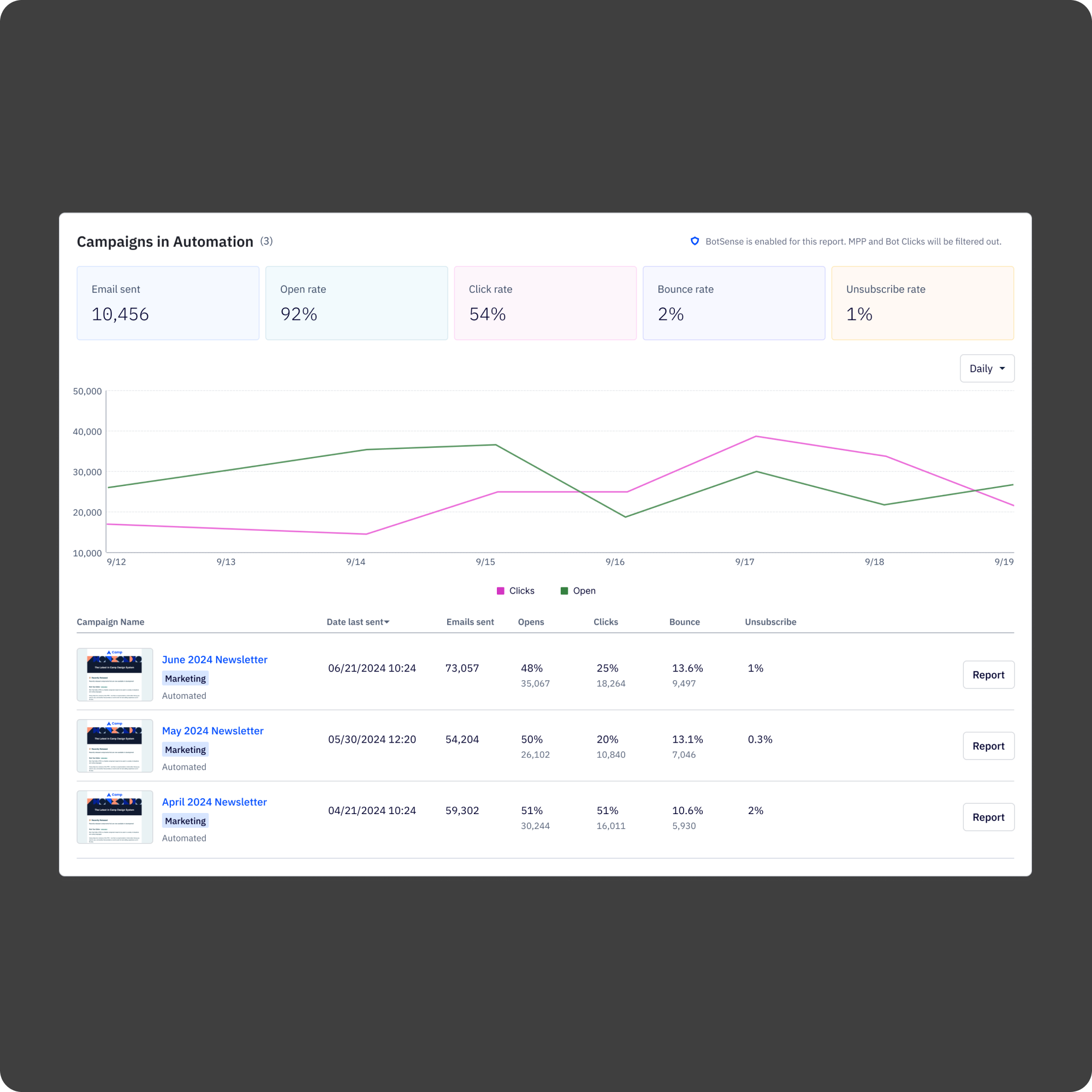
Below that, the campaigns-in-automation table breaks down performance by individual email, showing opens, clicks, bounces, and unsubscribes in one place. Users can jump directly to a campaign report from here, which was a connection the old report never made.
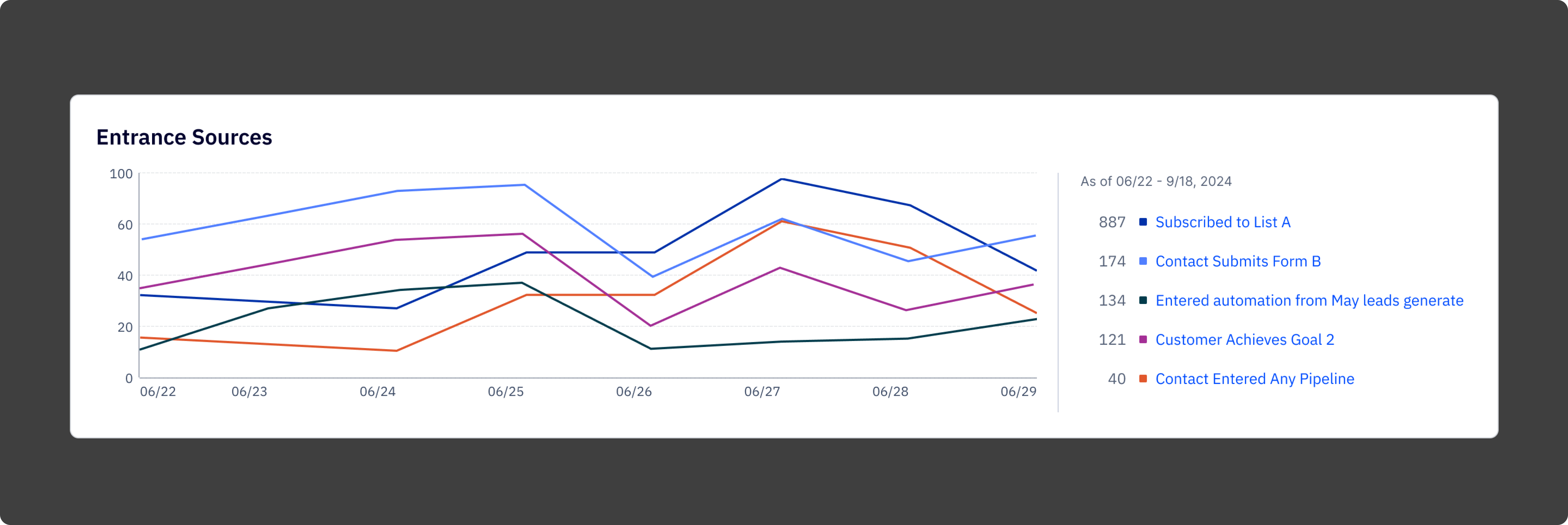
The entrance sources chart shows where contacts are entering the automation over time, broken down by trigger. This was one of the most requested pieces of data in research and one of the hardest things to find in the old report.
The whole thing is built on a modular component system, so the patterns established here carried into other reports in the overhaul rather than starting from scratch each time.
.png)
Reflection
The biggest thing I kept coming back to on this project was the difference between a report that shows data and a report that communicates it. The old report wasn't short on data. It was short on clarity. Every design decision, what to show at the top, how to structure the breakdown tables, where to put the entry points to deeper analysis, was really a decision about what the report was trying to say and in what order.
The component system work is what I'm most proud of in terms of reach. It would have been easier to design the automation report in isolation and move on. Taking the time to build something reusable made the whole reporting overhaul more coherent and saved meaningful time on the reports that came after.
What worked:
1. Starting with user interviews before touching the design. The research findings held up throughout the project and kept the work grounded when internal opinions started to diverge.
2. Designing the component system in parallel with the report, not after. It forced the right constraints early.
3. Iterating with a consistent user cohort. The continuity made feedback more specific and more honest.
4. Treating hierarchy as the primary design problem. Once the information architecture was right, the visual design followed relatively quickly.
What I'd do differently
1. Get prototypes in front of users earlier. The usability testing was valuable but came later than it should have.
2. Document component decisions more formally as they were being made. Several calls about how the KPI block should behave in different contexts were made verbally and had to be reconstructed later during engineering handoff.
3. Push harder on the data availability question at the start. Some constraints we hit mid-design could have been surfaced in the first week with the right conversations.