Building the data visualization foundation for a reporting overhaul.
The problem
ActiveCampaign's reporting had been running on an embedded Looker iframe for years. It worked in the sense that data was technically accessible, but it didn't feel like part of the product. The visual language was inconsistent, the charts were hard to read at a glance, and users couldn't quickly connect what they were looking at to decisions they needed to make.
When the company decided to rebuild reporting from scratch, the first question was: what do we actually build it with? Every report in the suite needed charts, KPI blocks, tables, and data breakdowns. Building those from scratch, one report at a time, would have been slow and would have produced an inconsistent result. The answer was to build the visualization layer once, do it right, and make it reusable everywhere.
That became my project.
Discovery & Research
Before touching anything in Figma, I spent time understanding the full scope of what the library needed to support. The reporting initiative covered automation, campaign, contact, SMS, and forms reports, each with different data types, different user goals, and different levels of complexity. A component that worked beautifully for campaign open rates needed to hold up equally well for contact activity timelines and automation conversion funnels.
I also looked closely at how existing charts were failing users. The problems were consistent: too many colors with no semantic meaning, no clear visual hierarchy between primary and supporting data, and chart types that were chosen for completeness rather than clarity. Users weren't confused because they didn't understand charts, they were confused because the charts weren't making a clear argument.
Competitive analysis across other marketing platforms helped establish a baseline for what good looked like in this category, and gave me a reference point for where there was room to do something more considered.
Process
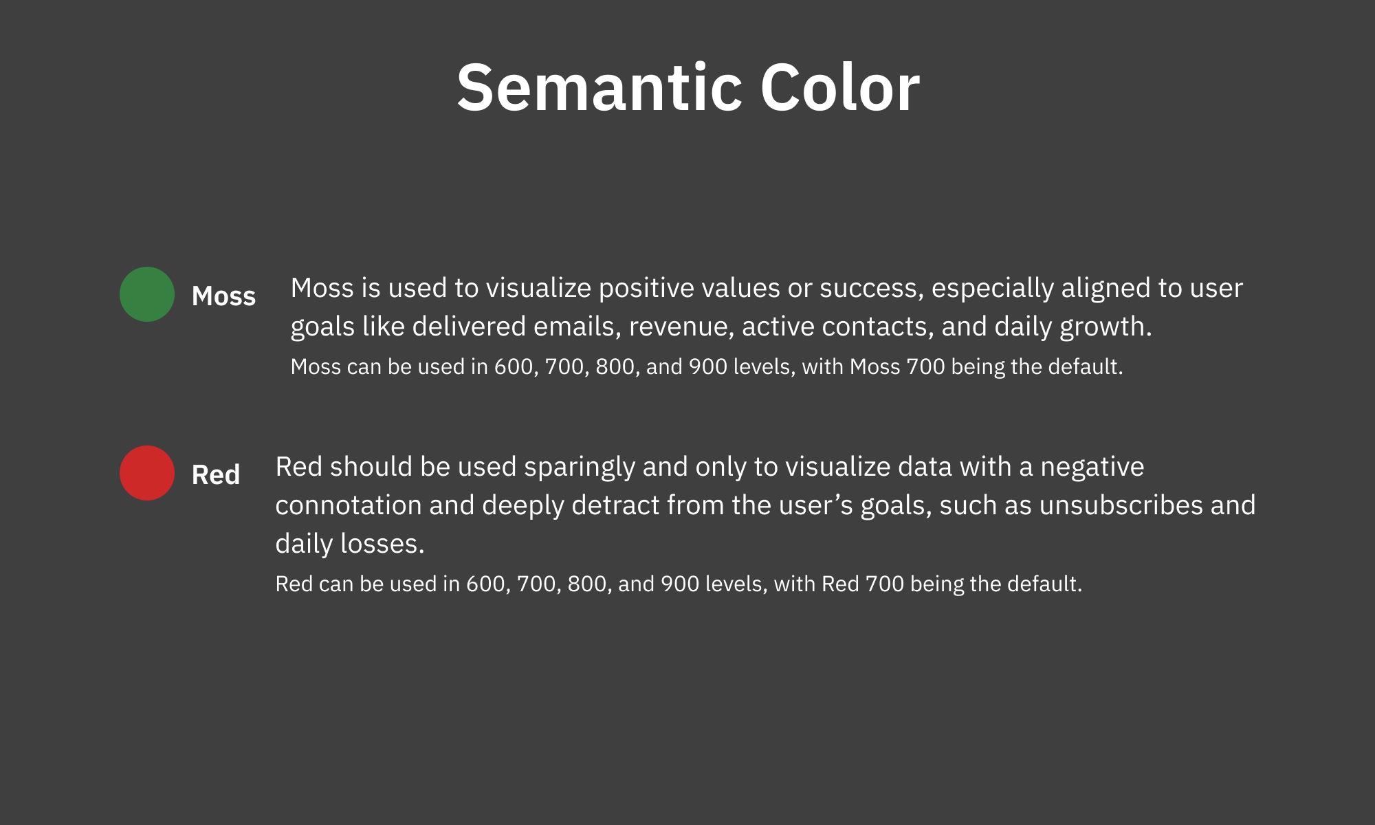
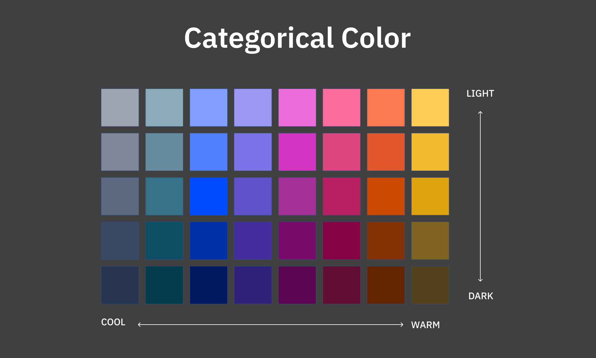
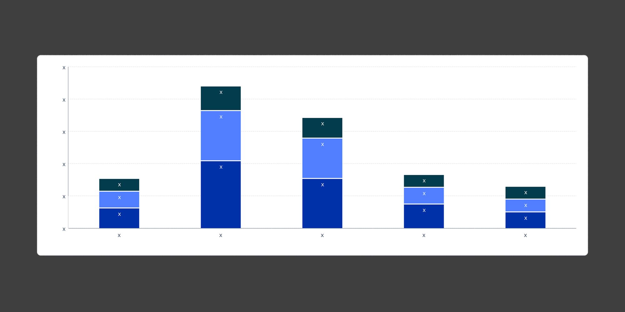
The first decision was to design the color system before designing any components. Color is the most load-bearing part of a data visualization library. Get it wrong and every chart built on top of it inherits the problem. I defined two color tracks: semantic colors with fixed meanings (Moss for positive outcomes, Red for negative ones) and a categorical palette for multi-series data, designed to maintain contrast and visual harmony regardless of how many series a chart displayed.
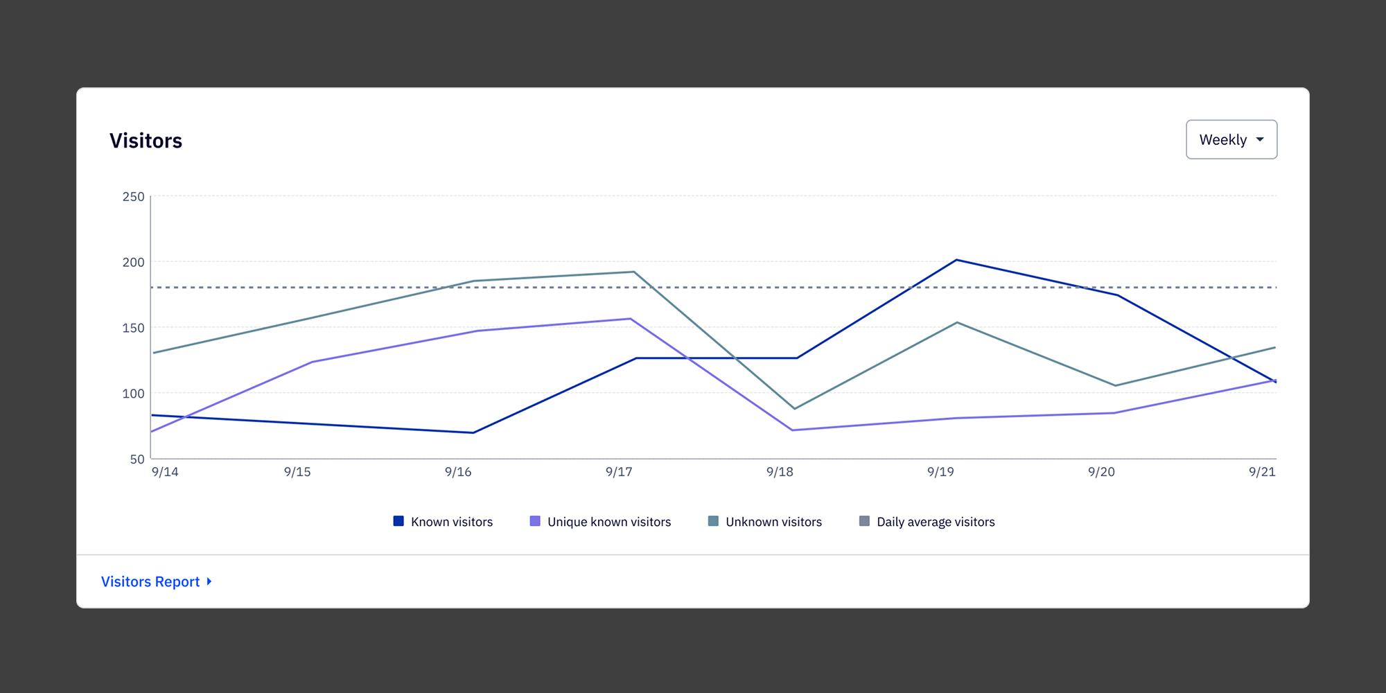
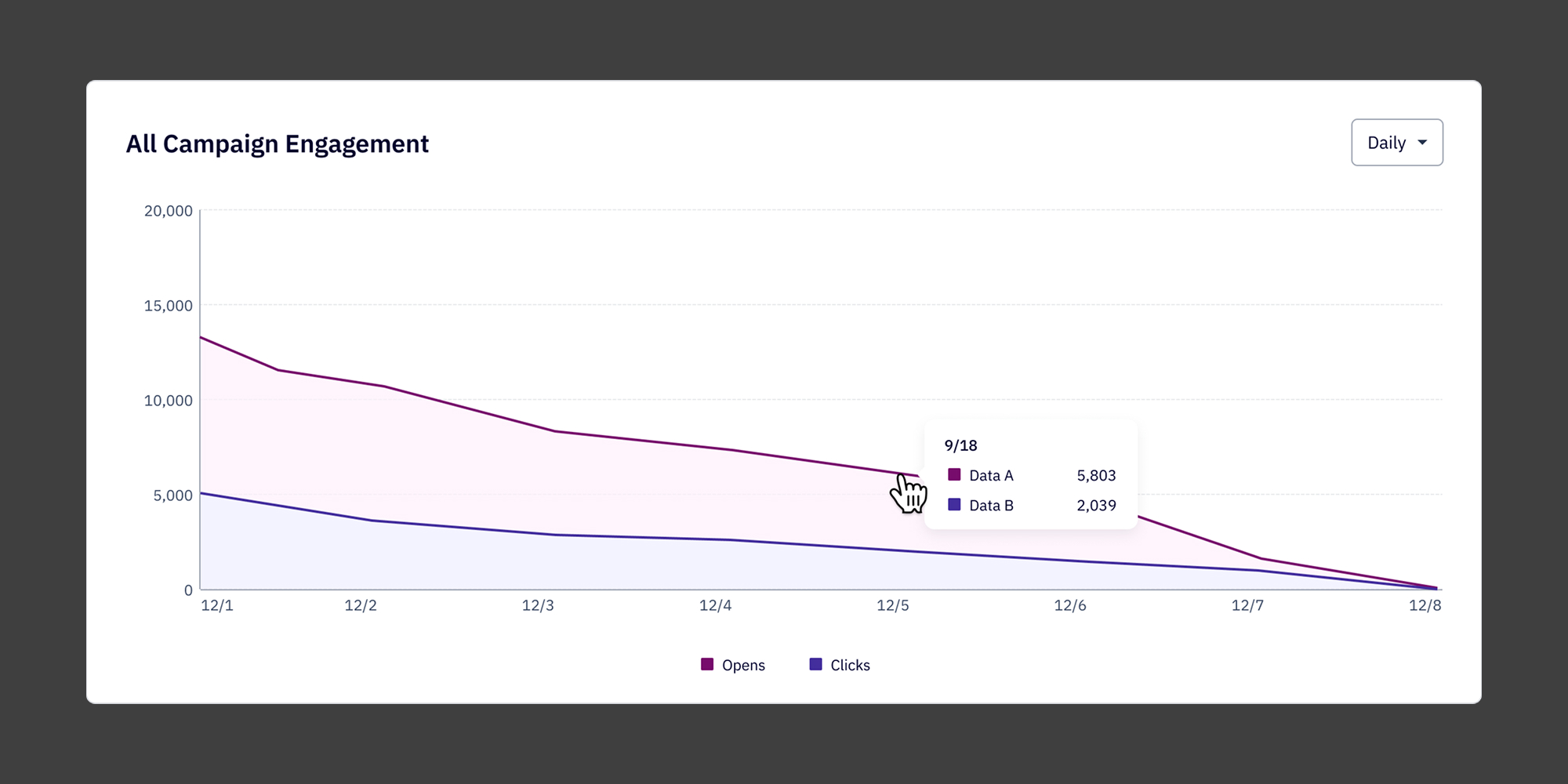
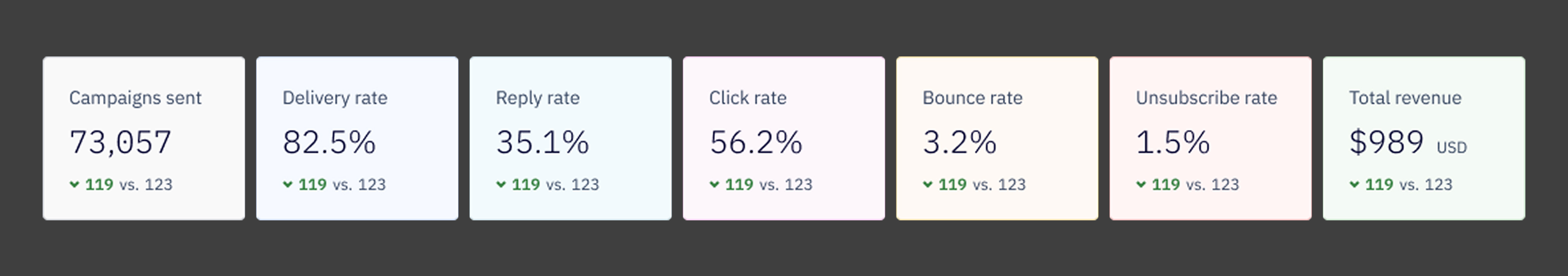
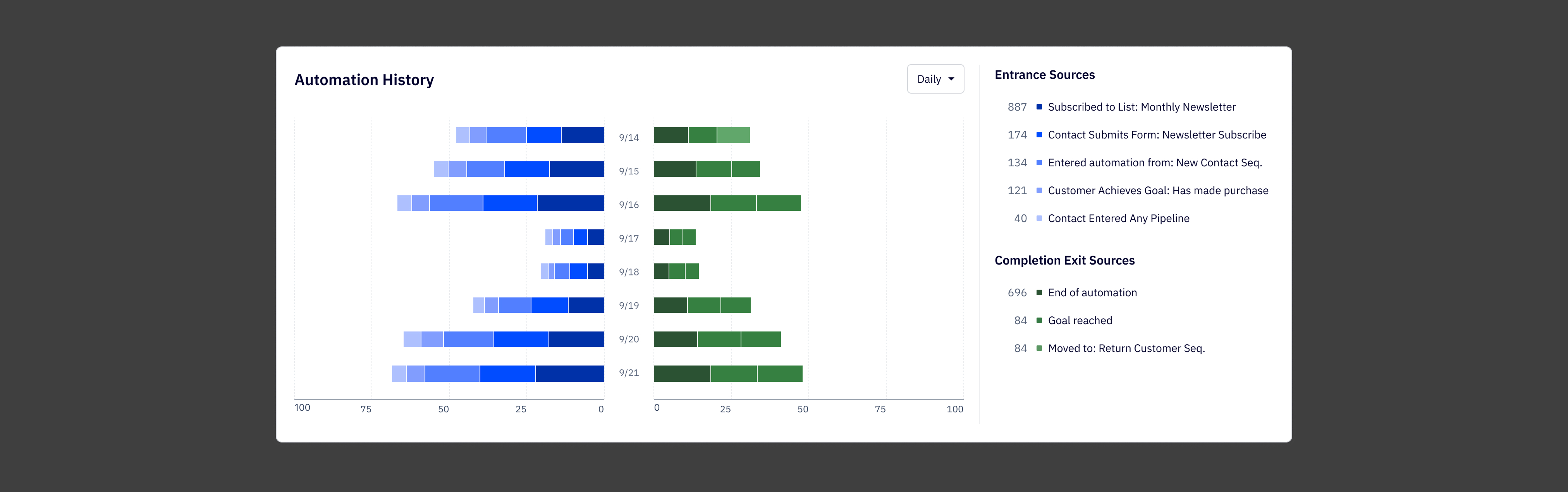
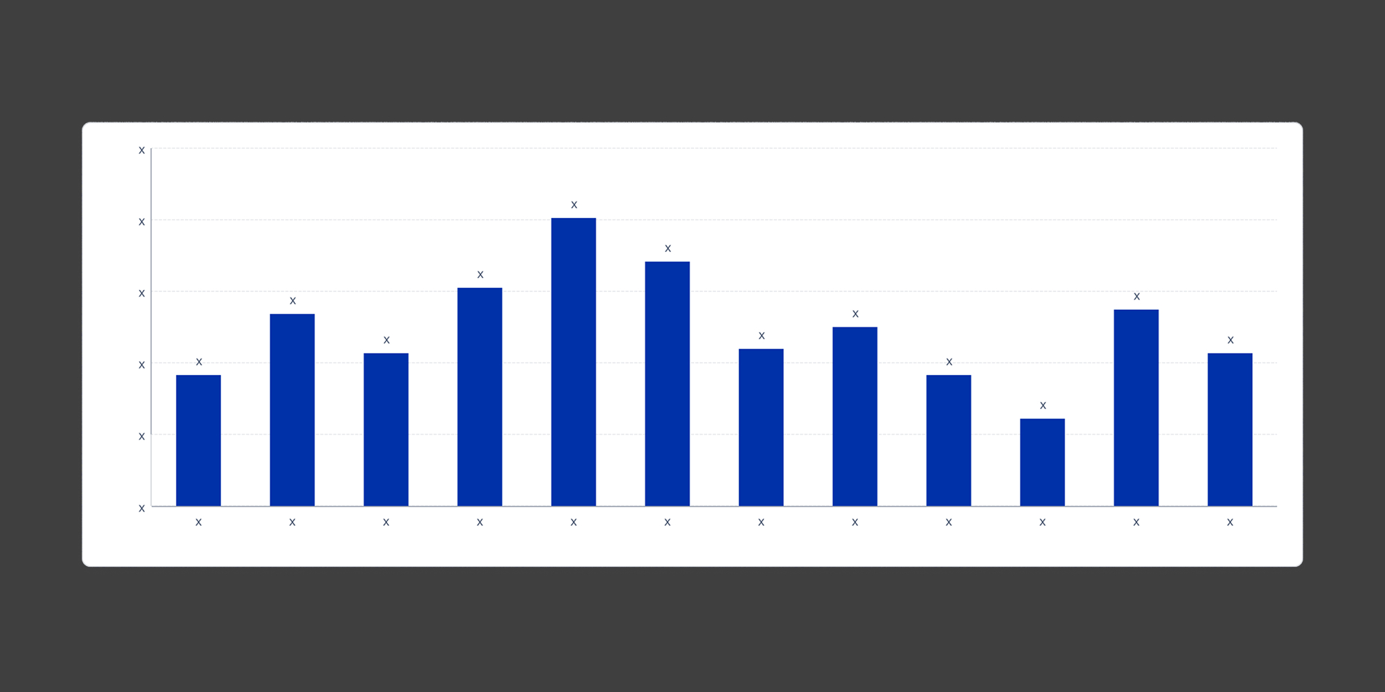
From there I built out the component set: line graphs, bar charts, stacked bars, butterfly charts, KPI cards with comparison states, and the full set of supporting elements — tooltips, legends, empty states, and loading states. Each component was designed for a specific job, not as a generic catch-all. A line chart used for trend analysis over time looks and behaves differently than one used for real-time monitoring, even if the underlying data structure is similar.
The hardest ongoing call was restraint. The instinct when building a library is to cover every case. The reality is that a component with too many configuration options becomes harder to use correctly than a few well-defined ones. I pushed to keep the surface area small and the documentation clear, so that the right choice was also the easy choice for whoever was building on top of it.
Documentation ended up being almost as much work as the components themselves. The library had to serve both designers creating new reports and engineers implementing them, so I wrote usage guidelines, color rules, do-and-don't pairings, and clear notes on when to use each chart type and when not to.
.jpg)
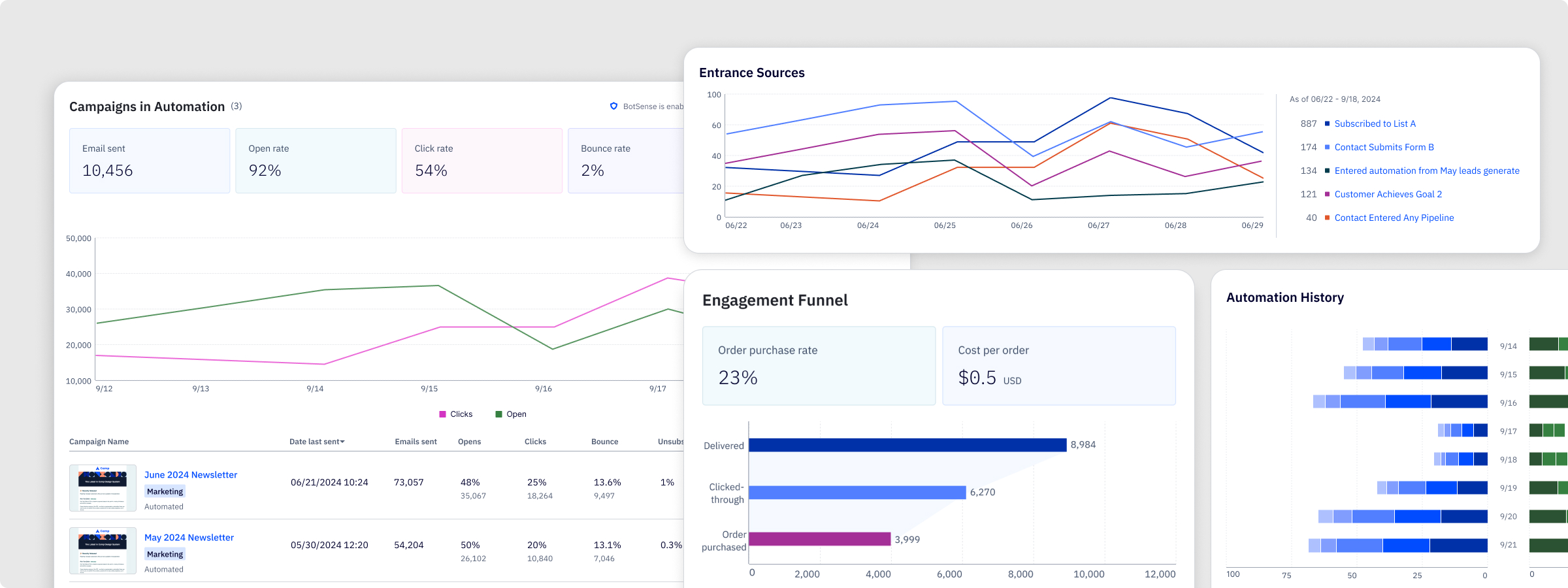
The Solution
The library shipped with a full set of visualization components covering the chart types needed across all five report surfaces. Every component was built to be reusable and configurable within defined limits, so reports could feel consistent without being identical.
The semantic color system gave meaning to color across every chart in the suite. Moss signals positive outcomes. Red flags negative ones. The categorical palette handles multi-series data in a sequence that maintains accessibility contrast at every step.
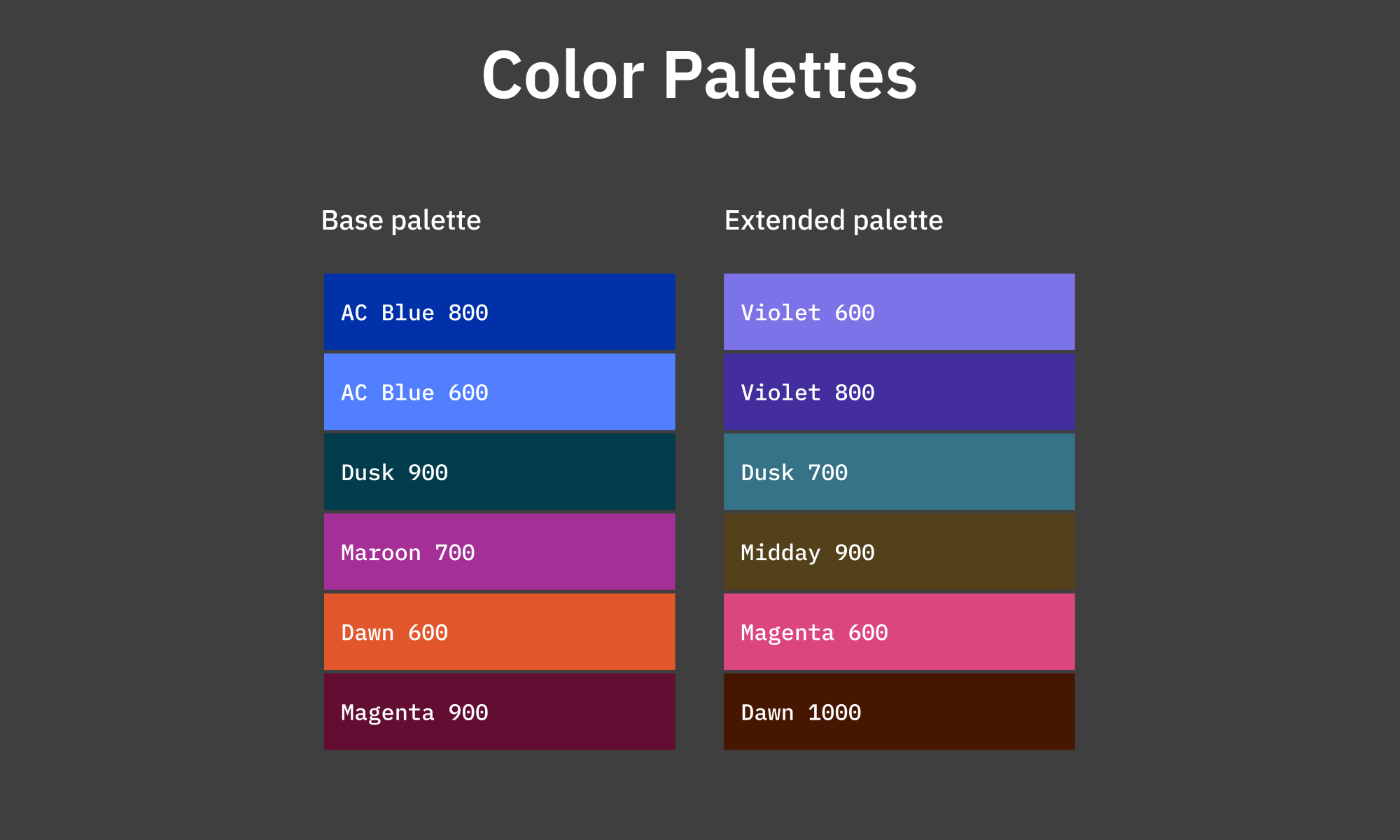
The component documentation lives alongside the Figma library and covers usage rules, color guidance, and engineering handoff notes, so the system can be extended without introducing inconsistency.
Reflection
This project was a different kind of design challenge than the report work I did alongside it. Building a component library isn't about solving one user problem, it's about building the infrastructure that lets other people solve user problems well. That changes how you make decisions. You're not optimizing for a single context, you're setting constraints that will hold up across contexts you can't fully predict.
What worked:
1. Designing the color system first. Every component decision downstream was easier because the color layer was already resolved.
2. Keeping the component surface area tight. Fewer, better-defined components outperform a large library of flexible ones every time.
3. Treating documentation as part of the deliverable. The library was only useful if people could use it correctly without asking questions.
4. Designing across all five report contexts before finalizing anything. Seeing how a component behaved in the most demanding context early surfaced edge cases that would have been painful to fix later.
What I'd do differently
1. Run a structured review with engineering earlier. A few implementation constraints came up late that required component adjustments. Earlier collaboration would have caught those.
2. Build a reference report in parallel as a test bed. Having a real use case to stress-test against would have validated the system faster than isolated component reviews.
3. Establish versioning conventions from the start. As the library grew, tracking changes and communicating them to engineering became more informal than it should have been.