Bringing Active Intelligence to the palm of your hand.
The problem
ActiveCampaign's mobile app had gone years without a meaningful update. In that time, the web product had grown into something genuinely new: a place where reps could generate campaigns with AI, search contacts and deals in natural language, and get a real read on how their business was performing. None of that existed on mobile.
What did exist was a dated CRM companion. You could look up a contact or pull up a deal, but the experience stopped there. The app felt like it belonged to a different era of the product, and it functioned like one too.
The gap wasn't just a feature list problem. It was a positioning problem. Active Intelligence was central to how ActiveCampaign was presenting itself to the market. But the moment a user stepped away from their desk, they lost access to it entirely. The goal was to fix that: make Active Intelligence genuinely mobile, not just technically available on a smaller screen.
Where we started
Discovery & Research
The timeline on this project was compressed, which meant we leaned on what was already known rather than running a full research cycle. That was the right call. The gaps between mobile and web had surfaced repeatedly across customer feedback, internal reviews, and conversations with the go-to-market team. We didn't need to find the problem. We needed to align on how to solve it.
Working sessions with stakeholders across product, engineering, and go-to-market surfaced three things quickly.
Active Intelligence had to be the centerpiece. The old app was organized around CRM objects: contacts, deals, lists. That made sense when the product was a CRM. But with Active Intelligence now central to the platform, that navigation model buried the most valuable parts of the experience. Moving AI creation tools, business insights, and natural language search to the top level wasn't a feature decision. It was a product positioning decision.
The visual gap was eroding trust. The old app looked like a different product. Different type, different patterns, different feel. For anyone moving between web and mobile regularly, it created real friction and made the product feel less considered than it was. A full visual refresh was never going to be purely cosmetic. It was about making the product feel like one thing.
The design system had to scale across both surfaces. Whatever we built for mobile needed to feel clearly related to the web without being a direct port. That meant building something new: a component library, AI-specific patterns, and a shared token system that could hold both experiences together without flattening either of them.
Process
The core challenge wasn't figuring out what to build. It was figuring out how to translate it.
The web experience of Active Intelligence was designed with space to work with. Persistent navigation, wide layouts, multi-step creation flows with room to breathe. Mobile has none of that. Every surface we wanted to bring over had to be reconsidered from scratch. What does generating an AI campaign actually look like on a 390px canvas? How do you present business insights in a way that's scannable in 30 seconds? How does natural language search feel native to mobile rather than like a shrunken version of the web?
We ran two parallel tracks.
Track one was the design system. Before touching any product screens, we built the mobile component library from scratch: typography scale, color tokens, spacing, dark mode, and a new set of AI-specific patterns including insight cards, generation entry points, prompt surfaces, and result states. All of it had to exist before we could design real flows. The goal wasn't to copy the web system. It was to build something that clearly shared a visual language with it. Doing this first meant every screen decision downstream had a foundation to build on instead of inventing patterns ad hoc.
Track two was the Active Intelligence surfaces themselves. We worked through each feature: business insights, AI campaign generation, AI email and form creation, natural language deal and contact search. We asked the same question each time: what does this need to do on mobile, and what can it shed? Someone on their phone isn't in a focused creation session at their desk. They're between meetings, reacting to something, or trying to get a quick read before a call. The surfaces needed to match that context: fast to get into, easy to act on, and light enough to be useful without a full work session.
Navigation was its own problem. Layering Active Intelligence on top of the old CRM-centric tab structure would have buried it. We rebuilt the nav to give Active Intelligence a clear home at the top level of the app, the first thing users encounter rather than something they have to hunt for.

The Solution
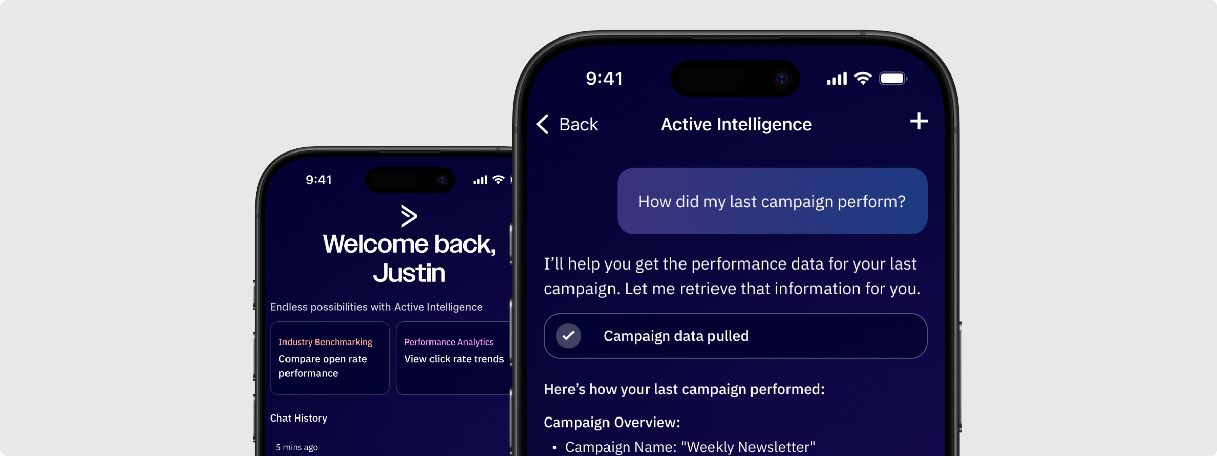
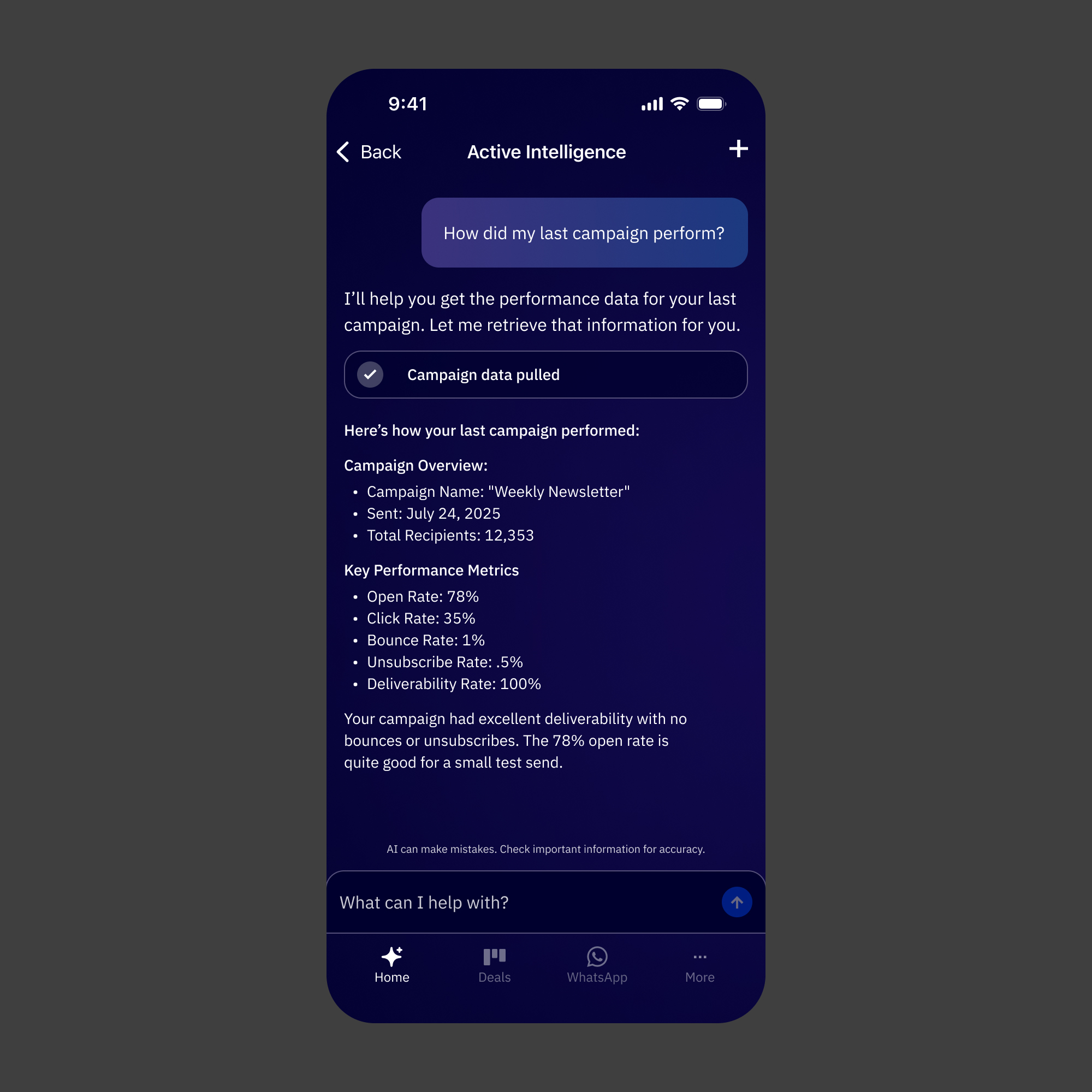
Active Intelligence as the anchor of the app. Business insights, AI campaign generation, AI email and form creation, and natural language search all live within a dedicated Active Intelligence space. Reps can check performance, create content, and explore their pipeline without ever needing to open their laptop.
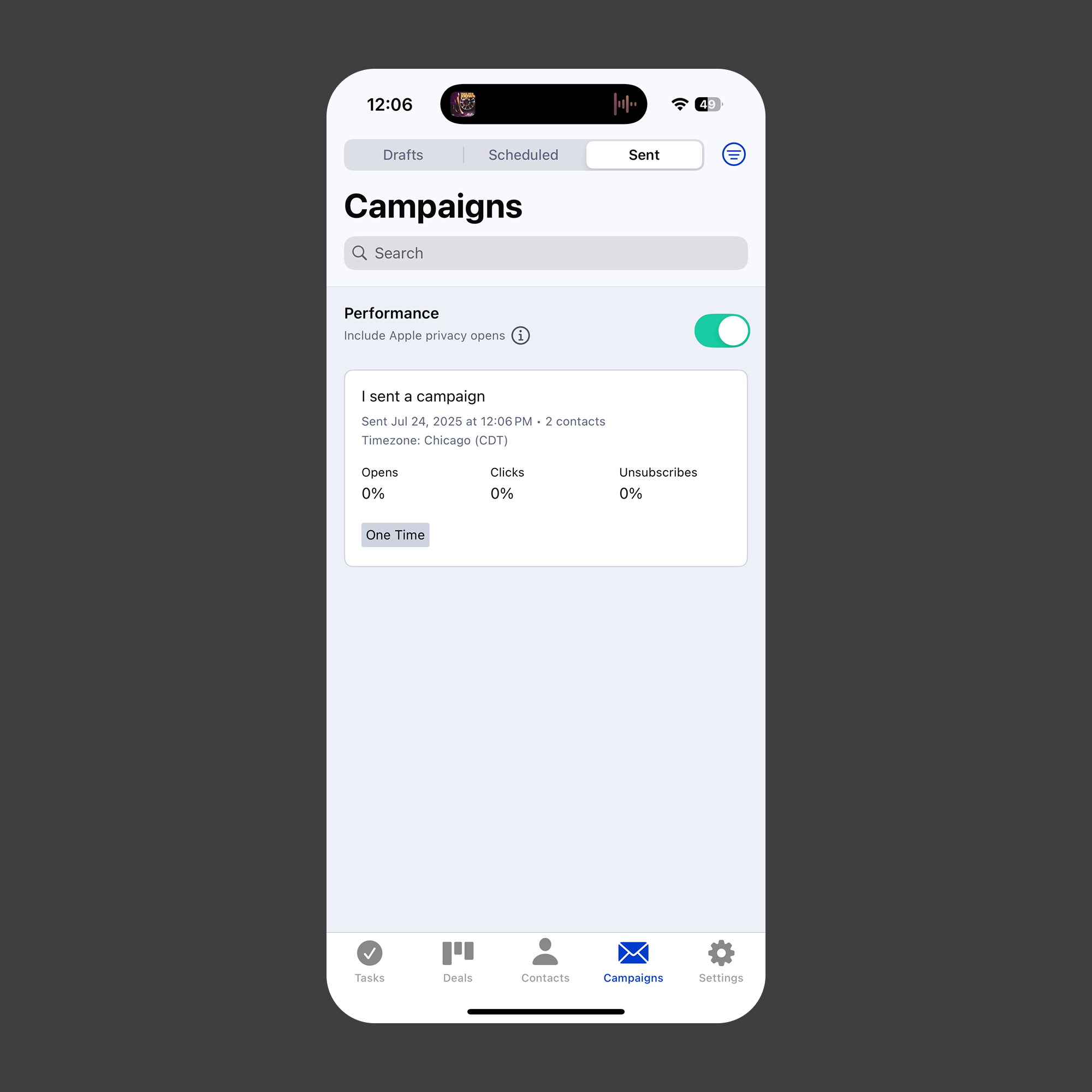
AI content creation built for mobile context. Campaigns, emails, and forms can be generated through the same AI-assisted flows that exist on web, adapted for a mobile interaction model. The patterns prioritize getting to a usable output fast, with lightweight editing and approval flows designed for shorter sessions and smaller screens.
Natural language search that feels native. Reps can search across deals and contacts using plain language, the same way they can on web. It's not a form with filters. Just a prompt and a result set.
Business insights at a glance. Performance summaries and AI-generated insights surface in a format built for quick reads. The goal was to give reps a real sense of how things are going without requiring them to dig.
A visual refresh that makes the product feel whole. New typography, an updated color system, dark mode, and a component set that feels unmistakably related to the web app. The old app looked like a different company made it. This one doesn't.
App Loading State
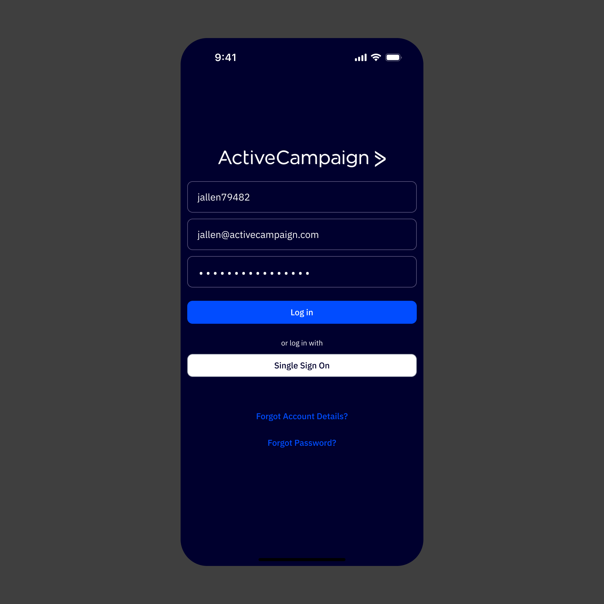
Log in Screen
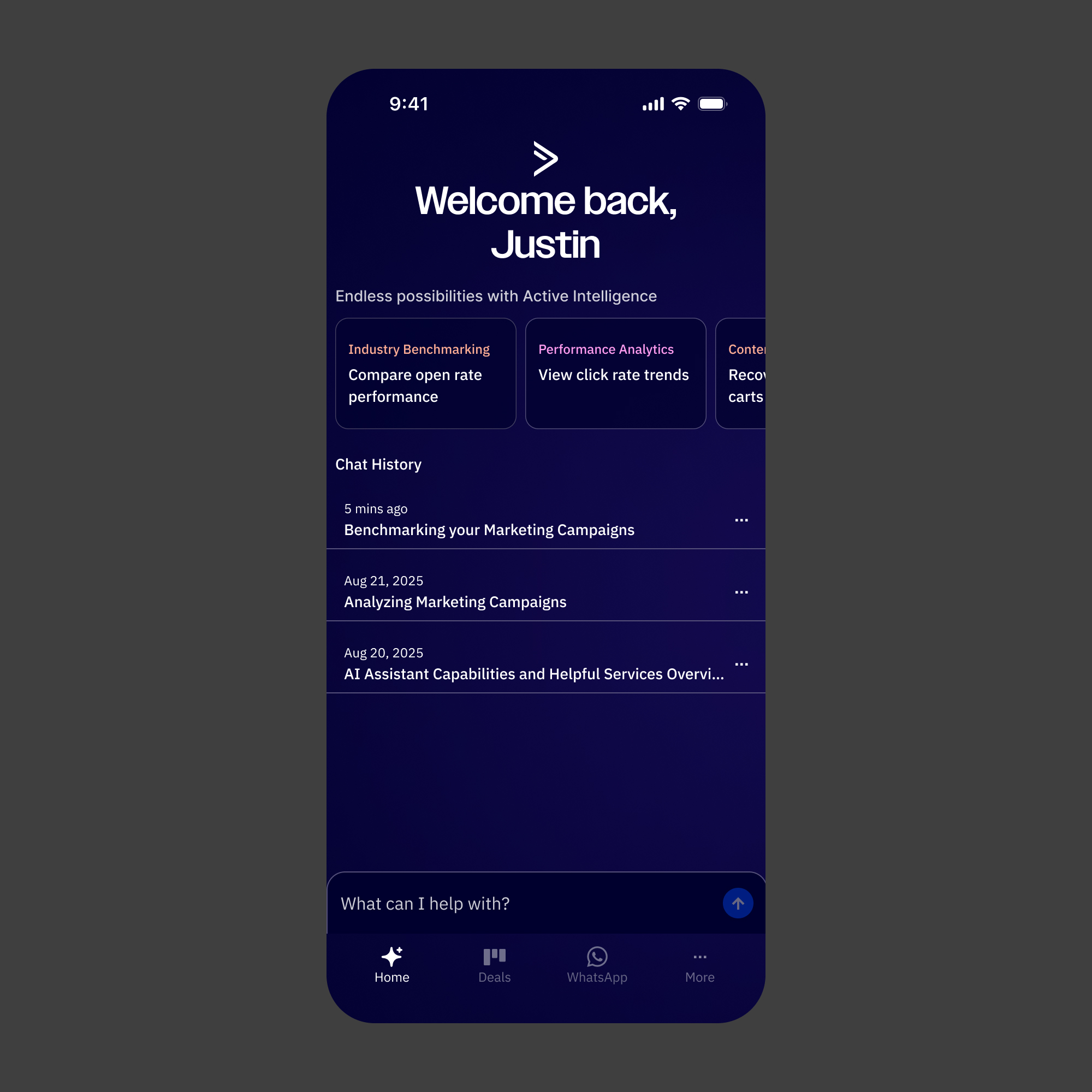
Active Intelligence Homepage
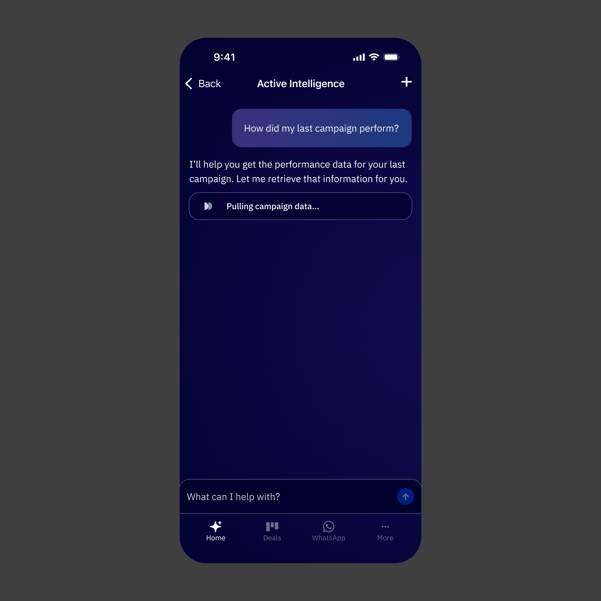
Active Intelligence Conversation Loading
Conversation Loaded
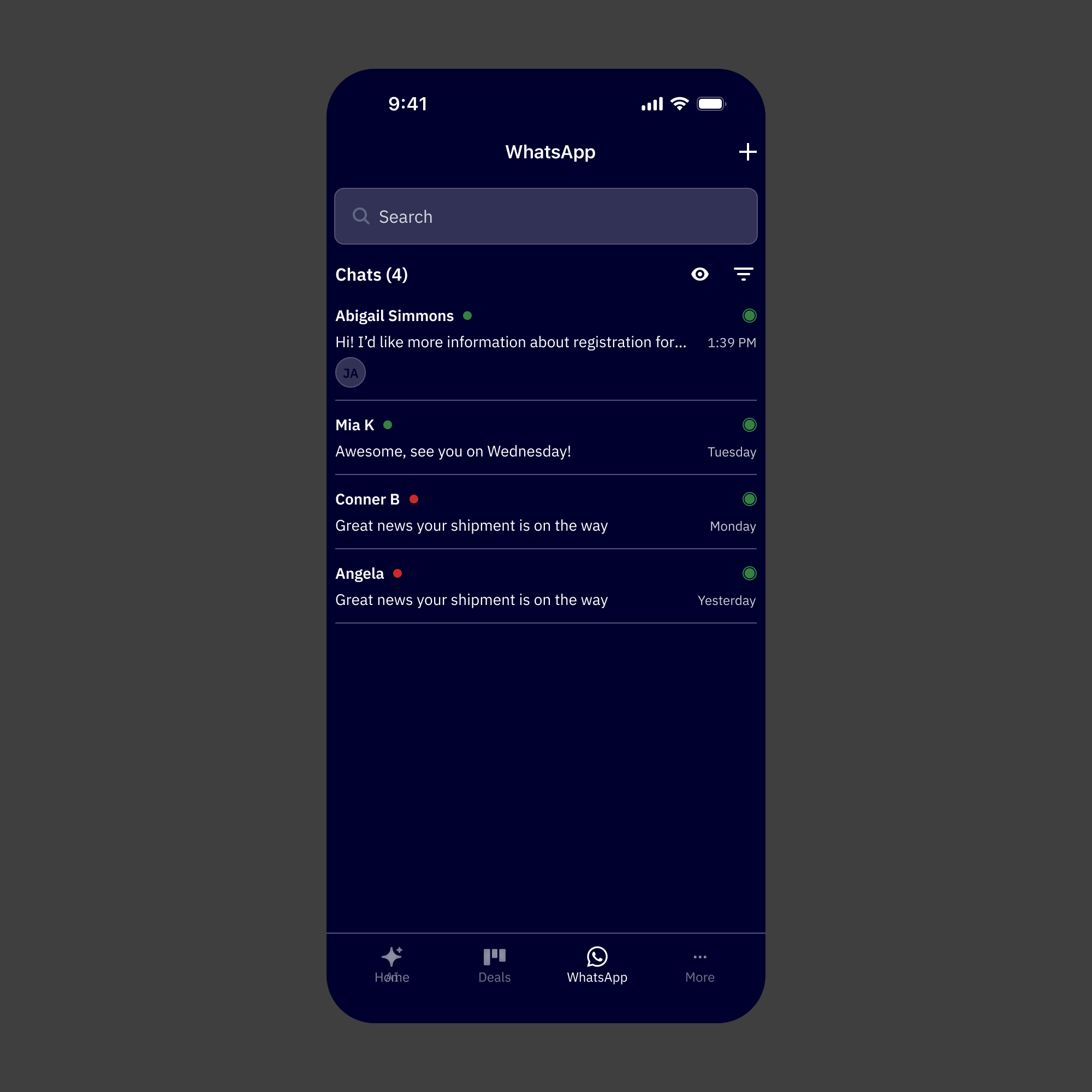
WhatsApp Conversation List
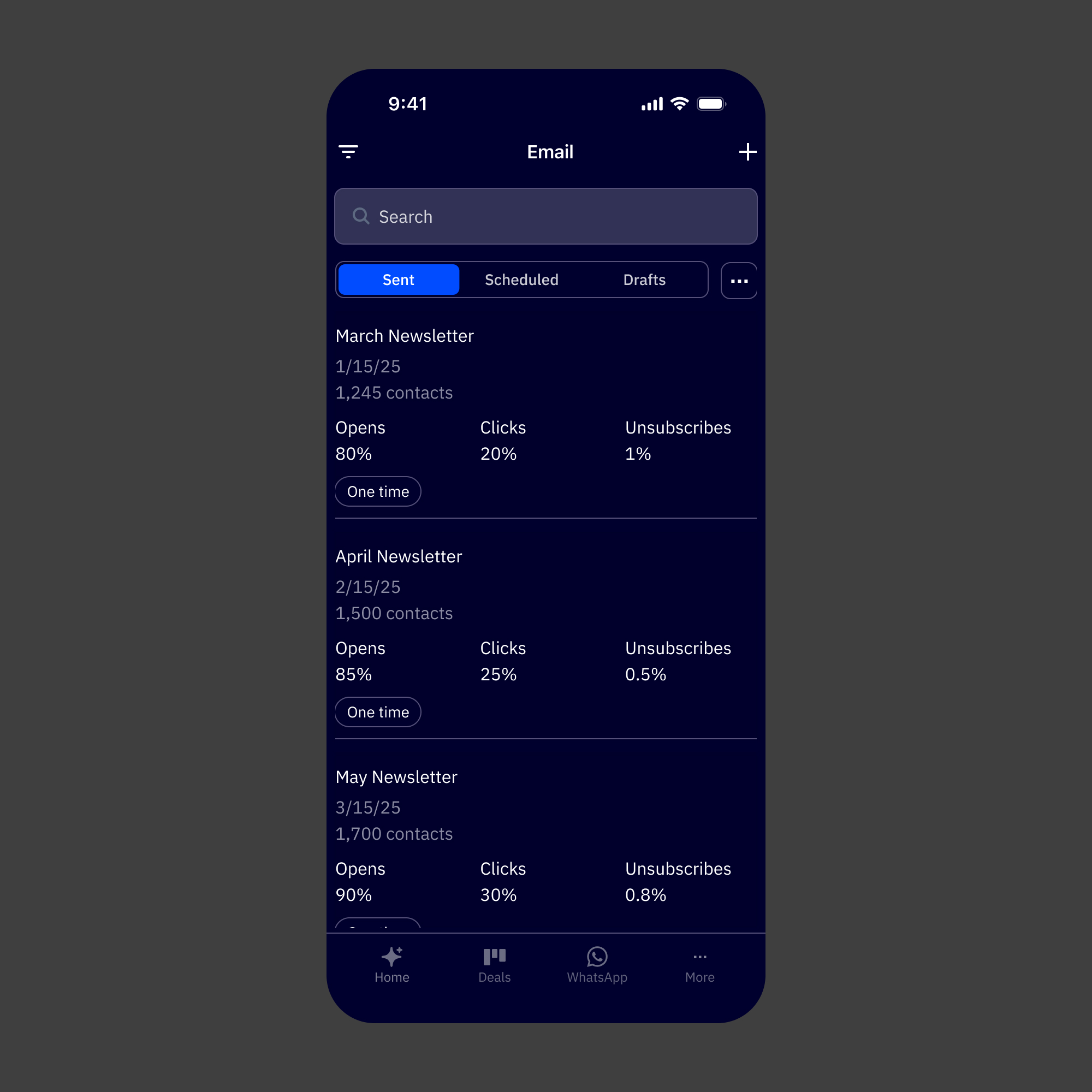
Email Default
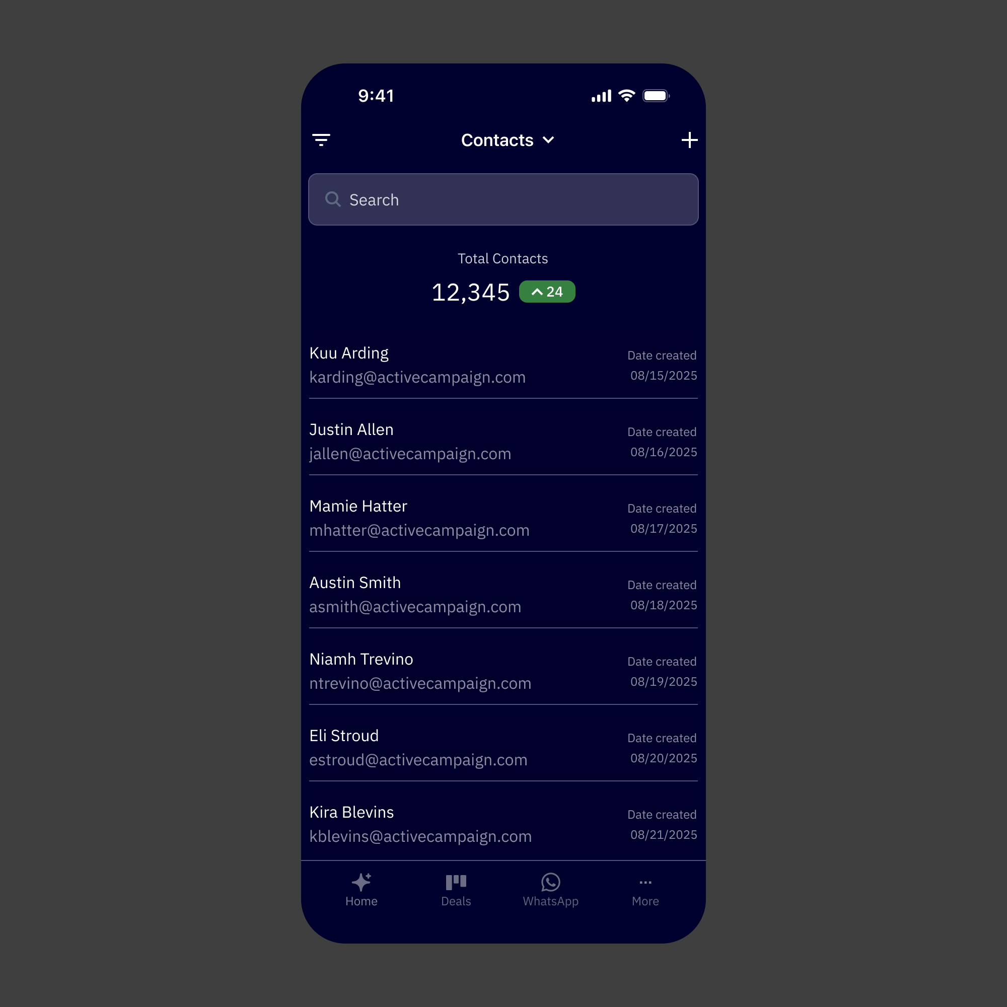
Contact Default
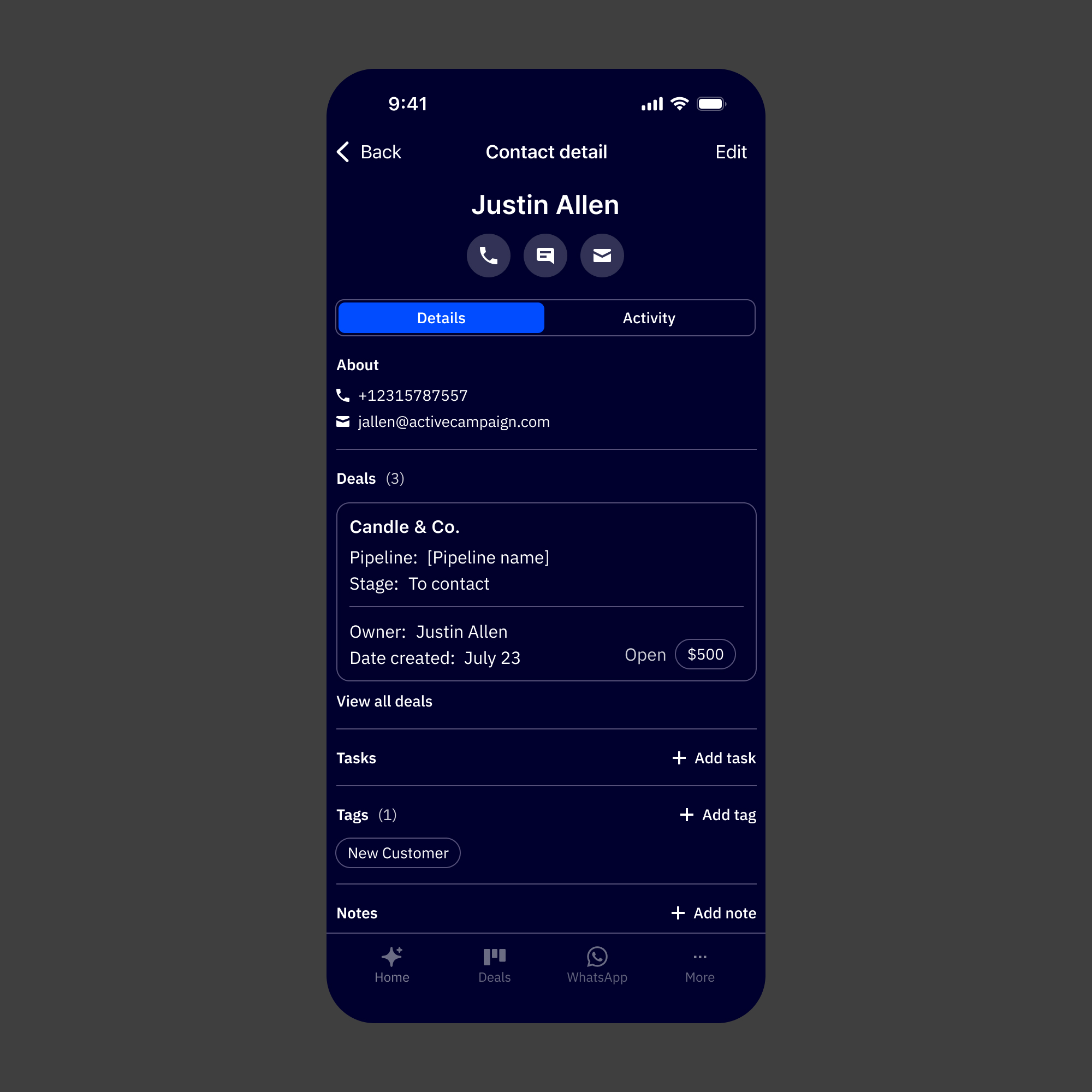
Contact Details
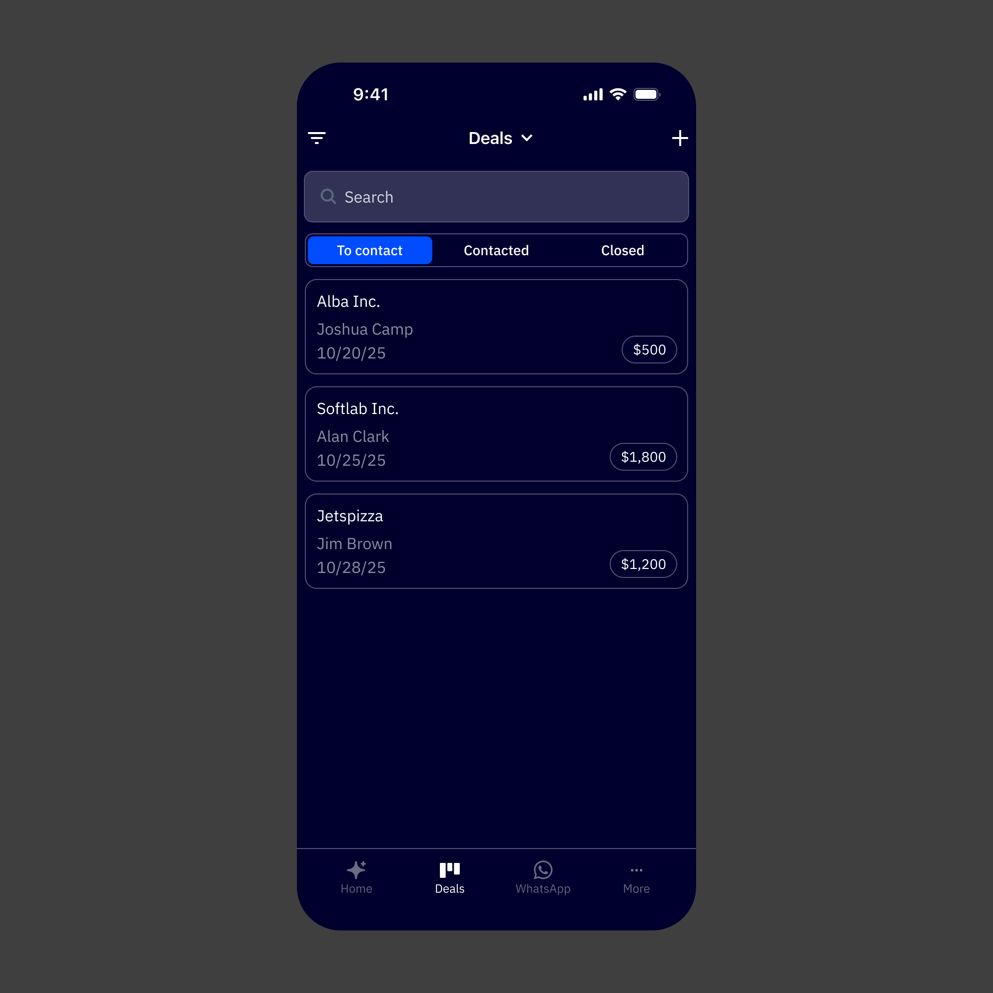
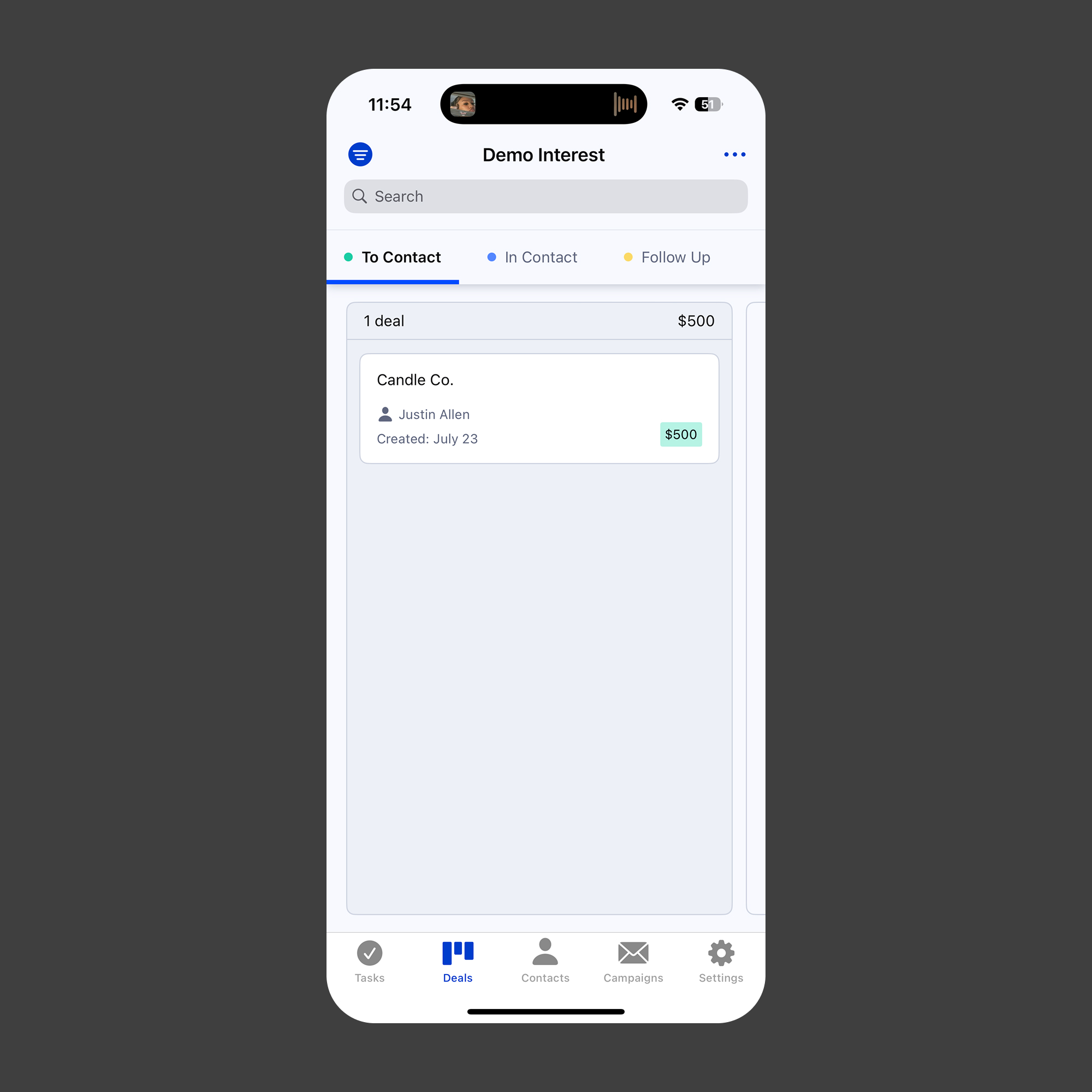
Deals Default
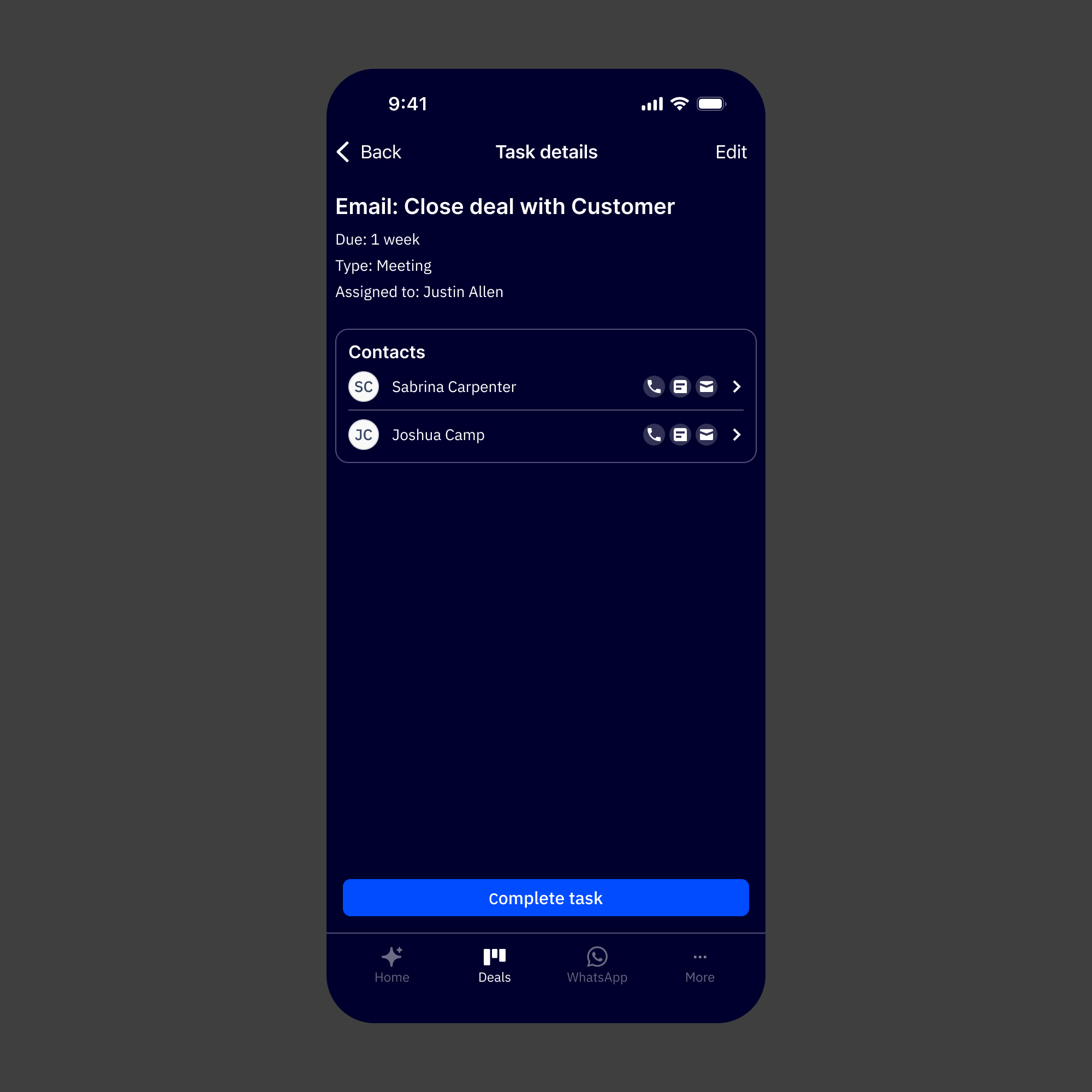
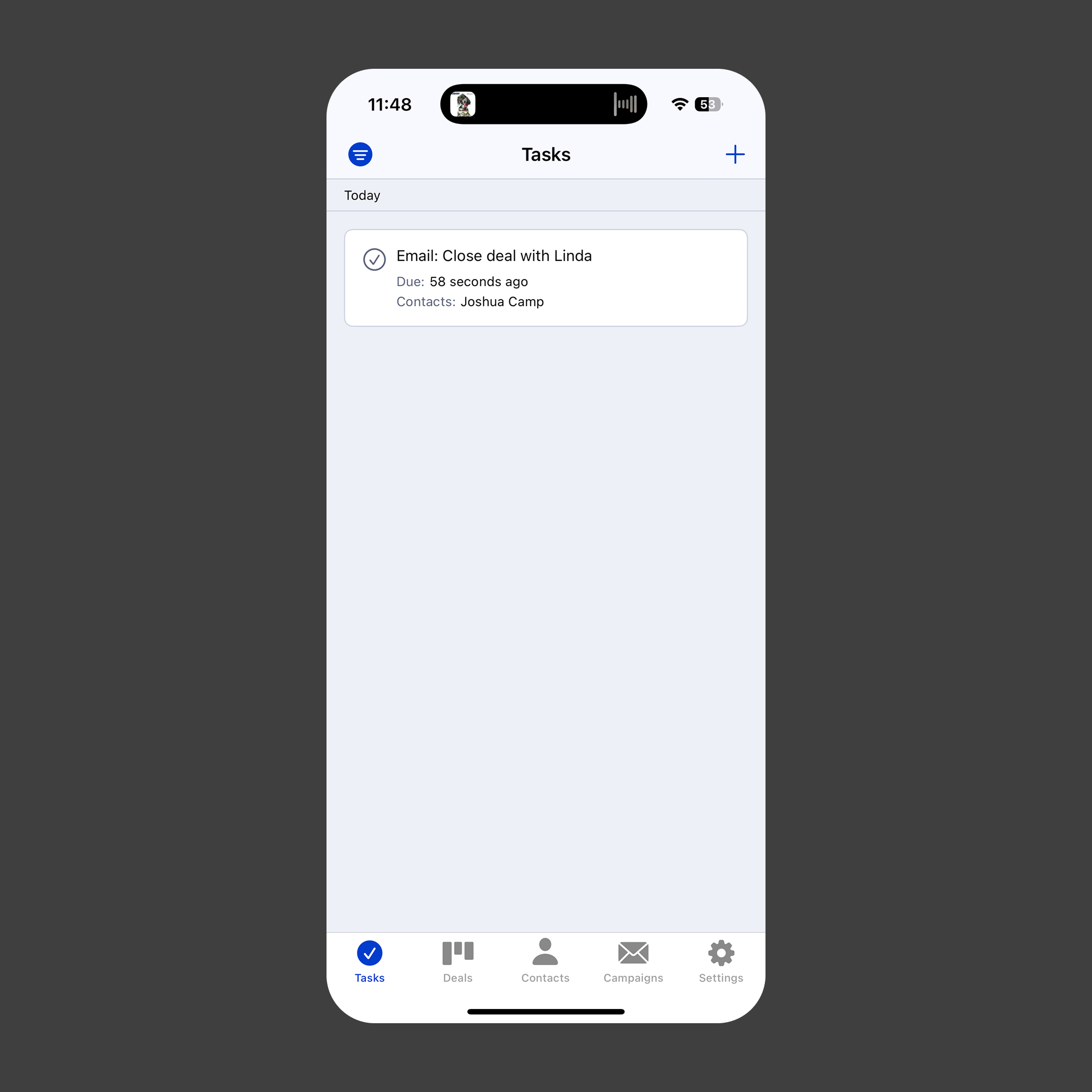
Task Details

Task Default
Reflection
The thing I kept returning to on this project was the difference between adapting and translating. Adapting would've meant taking what existed on the web and making it fit a smaller screen. Translating meant asking what the experience actually needed to be for someone using it on a phone, in a different context, with different constraints and a lot less available attention.
Building the design system before touching any product screens was the decision I'd stand behind most. It forced early clarity on patterns that would've otherwise gotten made up screen by screen, and it meant that by the time we were designing the Active Intelligence surfaces, we had a real shared vocabulary to work from. The consistency between web and mobile that stakeholders responded to wasn't accidental. It came from doing that foundational work first.
The CEO feedback was meaningful, but not just for the obvious reason. It was a signal that the strategic framing was right. Putting Active Intelligence at the center of the mobile experience, rather than treating it as a feature added to a CRM app, matched where the company was heading. That alignment between the design decisions and the product direction is what made the work land the way it did.
What worked:
1. Building the design system before screens. It made every subsequent decision faster, more consistent, and easier to defend.
2. Reframing mobile as an AI-first product rather than a CRM companion. That single shift shaped the navigation, the hierarchy, and the overall feel of the app.
3. Tight stakeholder alignment upfront. With a compressed timeline, having shared direction before execution meant we weren't relitigating decisions mid-build.
4. Designing AI creation patterns specifically for mobile context; short sessions, fast outputs, lightweight editing.
What I'd do differently
1. Push for at least a lightweight round of mobile-specific user research. The stakeholder input grounded the direction well, but hearing directly from users about how they actually use their phones in a workday would've sharpened a few of the creation flow decisions.
2. Start the design system work even earlier, ideally in parallel with the alignment phase. A couple of screen-level decisions had to pause while system questions got resolved.
3. Document the web-to-mobile translation decisions more formally as they were being made. Several of the calls about how to adapt specific AI patterns were made quickly and verbally. Writing those down would've helped engineering handoff and would be useful as the system scales.